Link to CCR:
https://m.youtube.com/watch?v=Rxbp9vfA4Fw
Yours Truly,
Sof
Saturday, April 14, 2018
Thursday, April 12, 2018


Tuesday, April 10, 2018
Article pt. 2
Hello everyone,

Yesterday I ran into a couple problems with my article design. The most important being, it was not cohesive with my partner's... Of course it pained me to continue working on the two page spread when I thought I was just about done with mine, but you gotta do what you gotta do!

In order to make my two-page spread look more cohesive with my partners, I did a couple things.
1) Changed the color scheme
2) Added the page number to the bottom left, and made the number bigger
3) I also made the background consistent, and attempted to make it lighter, but it was really hard to get the same color because I used an "infographic" layout, which is like a column, for the Q&A page, so I had to take screenshots of different things to format it in a way that would look good with the first page.
FOR INSTANCE:
I'm sure there may have been an easier way to do this, and center my text, but I just didn't know how. Therefore, after I arranged it how I wanted, I ended up smoothing the edges of each screenshot so it came out to look like one picture, and it came out like the final product above. Also, in attempt to make it lighter, I went on Lightroom and played around with the settings, but other than that, there wasn't much I could do.
That's about it...
I'm gonna show my partner in class tomorrow and hopefully I'll be done with it:)
Take Care,
Sof
Monday, April 9, 2018
Finally got to working on my article
Heyyyy guys,
I finished my article! As I stated prior, I did a two-page spread featuring my cover model, Candela Rivero, on fitness. Originally, I said I was going to do 32 ways, but there's no way... So I went to my cover page and changed it to 12. Additionally, I may have to play around with the text on the first page to see how it breaks when I put the two pages together because I don't want anything to get cut out. Also, In order to get the two pages the same size, I may put the turquoise cover reads column on the first page as well or I might play with the scaling of the second page by increasing the width and decreasing the height to make the two pages even. I'm not sure how, but I'm sure I'll figure it out....
I made the following edit on Canva!


Also, I just wanted to clarify that the background picture for the second page is a picture I took at Hollywood beach. The effect on the picture looks weird by itself, but I needed to play around with the contrast, exposure, and hue for it to look nicely besides the grey background on the first page.

Almost done!!

Final product coming soon!
With Best Wishes,
Sof
Saturday, April 7, 2018
Requested Edit
Hey guys,
Last class we had group meetings to get some final critiques before the component is DUE. Yes, due. How exciting. During the group meeting I got input on various thing....
First and foremost...
 |
| My classmates believed that the white text on my cover was slightly difficult to read. Frankly speaking, I like my old cover more than this one, but I believe that the contrast and dark background (which I focused on in this edit to make the white stand out) would make it much easier to read from afar if one was glimpsing at the aisle to purchase the magazine. Therefore, I am going to stick with this one. |
I changed the issue date to March rather than April (which is Raquel's issue)!!! My bad 😅😅
Secondly....
 |
| Referencing one of my previous posts, I stated that I believed the red font paired with the red lipstick was indicative that my idea of promoting Rashawn's red lipstick would be understood. Previously, I had a red tube of lipstick on the left, however, I later learned that the Ad looked much clearer without it. Therefore, JUST IN CASE, I added the words "velvet matte" on the top left of the Ad to emphasize the purpose. The grey color does not take away from the model or the cool art direction, as well as, it looks nicely against the black background. Therefore, I believe it works well with what I am trying to convey to the readers. |
Lastly...
 |
| This has to be my favorite part of the whole magazine, and now that I fixed the "V" in Vance, it is complete. I am not touching it. 10/10 |
Best Regards,
Sof
Thursday, April 5, 2018
Updates
Hey Guys,
So I have a couple of things to show you. First and foremost, refer back to my previous post for a reminder on how I was planning to do my table of contents. Also, I used flipsnack.com to help me make the two page spread (it worked relatively better).
Now, compare the old TOC to the following...


Why'd I change it? After many discussions with my partner, Raquel, we came to the conclusion that this format is much nicer and clean than the one I previously designed. Therefore, I started from scratch and got to work!
Additionally, I made a video to try to keep you guys updated and give my blog a little more personality, but the file was too big SOOOO here's a shorter one that I sent to my friends that I think will post, and I'll just explain it.
Also, check out this link....


I am close to finishing my magazine and will soon begin the other components of the project. Excited to see the final result.
Also, just noticed I have to change the issue month to March instead of April, whoops! Will do so now...
Keeping You Posted,
Sofi
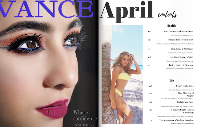
So I have a couple of things to show you. First and foremost, refer back to my previous post for a reminder on how I was planning to do my table of contents. Also, I used flipsnack.com to help me make the two page spread (it worked relatively better).
Now, compare the old TOC to the following...

First page of TOC

2nd page of TOC
Additionally, I made a video to try to keep you guys updated and give my blog a little more personality, but the file was too big SOOOO here's a shorter one that I sent to my friends that I think will post, and I'll just explain it.
Also, check out this link....

Ok so, my cover page is more or less the same as you last saw it. The only difference is
that I changed the spacing of the letters a bit in attempt to make the "How One
Woman..." not blend in as much with the leaves in the background. I also made it the
same font as the other two cover lines, because I sent it in a group chat and they told
me it looks strange to have ONE cover line a different font since there aren't too many, but I don't think it helped much. Either way, I like my cover. It's sexy, it's clean.. I dig it.

So for this I changed the format of the Ad. Specifically, I took out the lipstick and the words on the top right of the page that said "Limited Edition". At first, it was to make the picture fit on the page; however, I really like how clean it looks. The art direction that I was going for was to create a sense of elegance for older woman, but a sexy, contemporary feel as well. Nevertheless, I feel like the bold, red lips stand out, and the brand's bold, red title indicates that the following is an advertisement, specifically for makeup. However, just in case, I included an article "Rashawn's Velvet Matte" under the beauty section in my table of contents for clarification. In addition, I feel like the table of contents came out very clean and its white background contrasts well with the Ad on the previous page.

I am concerned about 2 things on this spread. 1) I had the same problem with the scaling of the picture with the Vance ad and it cut out part of the "V" which is not good. Secondly, I was concerned that the "..." and the "once" in confidence is going to be hard to read when the page folds over. Yet, if you checked out the link one can argue that this is how the magazine would look like if the magazine was folded. I am going to have to ask around anyways and try to fix these issues; I have not come up with a better idea than try to play around with the apps I have for this project and pray it works out. Also, I gave the magazine a "shadow" element which made the Vance Ad lighter, but I feel like it enhances the model's face, and I am a total fan. Lastly, I believe like the second table of contents page was very cohesive with the first page, and that the white background contrasts well with the Vance add much like the other spread above, as well as, its clean format is attractive.
Also, just noticed I have to change the issue month to March instead of April, whoops! Will do so now...
Keeping You Posted,
Sofi
Sunday, April 1, 2018
#SHOOK
LET ME TELL YA SOMETHING...
So today I was going to put Berkshire together so I could get a visual image of what the magazine would look like. I'm a super visual person, so I wanted to see how it was coming together, compare color schemes, etc. BUT NOOOOOOO! I literally just spent the past two hours on 6 different apps attempting to do the following and it doesn't work. I am #SHOOK. I got so annoyed to the point where I began doodling the background in to make the pictures even, but I needed the lines to be perfectly symmetrical and after an hour of drawing (Without saving my work) my phone, which I was using for Pixlr, just died on me. In addition, my wifi isn't working (tried uploading a gif to lighten the mood, but it didn't load so there ya have it).
Summary:
I'm not having it:))))) I'll try again tomorrow. Need to step away from this project before I rip my hair out. Thanks for reading my mini rant, you da best!
TO-DO LIST:
- Figure out how to put together magazine so it looks like a two-page spread
- Write article
- CCR
- Reflection
Yours truly,
Sof
Subscribe to:
Posts (Atom)
-
 Hey, so I updated my cover :) I made my own barcode using a free online barcode in seconds A couple posts ago I have said that I neede...
 -
According to the article “Setting Goals for Distribution” , one has to think about a couple of things before dealing with distribution me...
