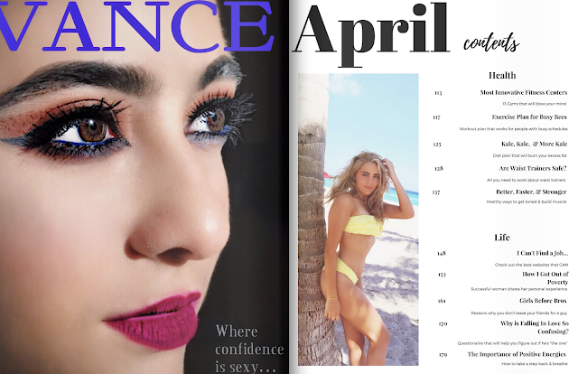
So I have a couple of things to show you. First and foremost, refer back to my previous post for a reminder on how I was planning to do my table of contents. Also, I used flipsnack.com to help me make the two page spread (it worked relatively better).
Now, compare the old TOC to the following...
First page of TOC
2nd page of TOC
Additionally, I made a video to try to keep you guys updated and give my blog a little more personality, but the file was too big SOOOO here's a shorter one that I sent to my friends that I think will post, and I'll just explain it.
Also, check out this link....
Ok so, my cover page is more or less the same as you last saw it. The only difference is
that I changed the spacing of the letters a bit in attempt to make the "How One
Woman..." not blend in as much with the leaves in the background. I also made it the
same font as the other two cover lines, because I sent it in a group chat and they told
me it looks strange to have ONE cover line a different font since there aren't too many, but I don't think it helped much. Either way, I like my cover. It's sexy, it's clean.. I dig it.
So for this I changed the format of the Ad. Specifically, I took out the lipstick and the words on the top right of the page that said "Limited Edition". At first, it was to make the picture fit on the page; however, I really like how clean it looks. The art direction that I was going for was to create a sense of elegance for older woman, but a sexy, contemporary feel as well. Nevertheless, I feel like the bold, red lips stand out, and the brand's bold, red title indicates that the following is an advertisement, specifically for makeup. However, just in case, I included an article "Rashawn's Velvet Matte" under the beauty section in my table of contents for clarification. In addition, I feel like the table of contents came out very clean and its white background contrasts well with the Ad on the previous page.
I am concerned about 2 things on this spread. 1) I had the same problem with the scaling of the picture with the Vance ad and it cut out part of the "V" which is not good. Secondly, I was concerned that the "..." and the "once" in confidence is going to be hard to read when the page folds over. Yet, if you checked out the link one can argue that this is how the magazine would look like if the magazine was folded. I am going to have to ask around anyways and try to fix these issues; I have not come up with a better idea than try to play around with the apps I have for this project and pray it works out. Also, I gave the magazine a "shadow" element which made the Vance Ad lighter, but I feel like it enhances the model's face, and I am a total fan. Lastly, I believe like the second table of contents page was very cohesive with the first page, and that the white background contrasts well with the Vance add much like the other spread above, as well as, its clean format is attractive.
Also, just noticed I have to change the issue month to March instead of April, whoops! Will do so now...
Keeping You Posted,
Sofi


No comments:
Post a Comment