Link to CCR:
https://m.youtube.com/watch?v=Rxbp9vfA4Fw
Yours Truly,
Sof
Saturday, April 14, 2018
Thursday, April 12, 2018


Tuesday, April 10, 2018
Article pt. 2
Hello everyone,

Yesterday I ran into a couple problems with my article design. The most important being, it was not cohesive with my partner's... Of course it pained me to continue working on the two page spread when I thought I was just about done with mine, but you gotta do what you gotta do!

In order to make my two-page spread look more cohesive with my partners, I did a couple things.
1) Changed the color scheme
2) Added the page number to the bottom left, and made the number bigger
3) I also made the background consistent, and attempted to make it lighter, but it was really hard to get the same color because I used an "infographic" layout, which is like a column, for the Q&A page, so I had to take screenshots of different things to format it in a way that would look good with the first page.
FOR INSTANCE:
I'm sure there may have been an easier way to do this, and center my text, but I just didn't know how. Therefore, after I arranged it how I wanted, I ended up smoothing the edges of each screenshot so it came out to look like one picture, and it came out like the final product above. Also, in attempt to make it lighter, I went on Lightroom and played around with the settings, but other than that, there wasn't much I could do.
That's about it...
I'm gonna show my partner in class tomorrow and hopefully I'll be done with it:)
Take Care,
Sof
Monday, April 9, 2018
Finally got to working on my article
Heyyyy guys,
I finished my article! As I stated prior, I did a two-page spread featuring my cover model, Candela Rivero, on fitness. Originally, I said I was going to do 32 ways, but there's no way... So I went to my cover page and changed it to 12. Additionally, I may have to play around with the text on the first page to see how it breaks when I put the two pages together because I don't want anything to get cut out. Also, In order to get the two pages the same size, I may put the turquoise cover reads column on the first page as well or I might play with the scaling of the second page by increasing the width and decreasing the height to make the two pages even. I'm not sure how, but I'm sure I'll figure it out....
I made the following edit on Canva!


Also, I just wanted to clarify that the background picture for the second page is a picture I took at Hollywood beach. The effect on the picture looks weird by itself, but I needed to play around with the contrast, exposure, and hue for it to look nicely besides the grey background on the first page.

Almost done!!

Final product coming soon!
With Best Wishes,
Sof
Saturday, April 7, 2018
Requested Edit
Hey guys,
Last class we had group meetings to get some final critiques before the component is DUE. Yes, due. How exciting. During the group meeting I got input on various thing....
First and foremost...
 |
| My classmates believed that the white text on my cover was slightly difficult to read. Frankly speaking, I like my old cover more than this one, but I believe that the contrast and dark background (which I focused on in this edit to make the white stand out) would make it much easier to read from afar if one was glimpsing at the aisle to purchase the magazine. Therefore, I am going to stick with this one. |
I changed the issue date to March rather than April (which is Raquel's issue)!!! My bad 😅😅
Secondly....
 |
| Referencing one of my previous posts, I stated that I believed the red font paired with the red lipstick was indicative that my idea of promoting Rashawn's red lipstick would be understood. Previously, I had a red tube of lipstick on the left, however, I later learned that the Ad looked much clearer without it. Therefore, JUST IN CASE, I added the words "velvet matte" on the top left of the Ad to emphasize the purpose. The grey color does not take away from the model or the cool art direction, as well as, it looks nicely against the black background. Therefore, I believe it works well with what I am trying to convey to the readers. |
Lastly...
 |
| This has to be my favorite part of the whole magazine, and now that I fixed the "V" in Vance, it is complete. I am not touching it. 10/10 |
Best Regards,
Sof
Thursday, April 5, 2018
Updates
Hey Guys,
So I have a couple of things to show you. First and foremost, refer back to my previous post for a reminder on how I was planning to do my table of contents. Also, I used flipsnack.com to help me make the two page spread (it worked relatively better).
Now, compare the old TOC to the following...


Why'd I change it? After many discussions with my partner, Raquel, we came to the conclusion that this format is much nicer and clean than the one I previously designed. Therefore, I started from scratch and got to work!
Additionally, I made a video to try to keep you guys updated and give my blog a little more personality, but the file was too big SOOOO here's a shorter one that I sent to my friends that I think will post, and I'll just explain it.
Also, check out this link....


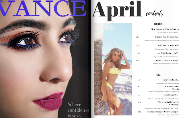
I am close to finishing my magazine and will soon begin the other components of the project. Excited to see the final result.
Also, just noticed I have to change the issue month to March instead of April, whoops! Will do so now...
Keeping You Posted,
Sofi
So I have a couple of things to show you. First and foremost, refer back to my previous post for a reminder on how I was planning to do my table of contents. Also, I used flipsnack.com to help me make the two page spread (it worked relatively better).
Now, compare the old TOC to the following...

First page of TOC

2nd page of TOC
Additionally, I made a video to try to keep you guys updated and give my blog a little more personality, but the file was too big SOOOO here's a shorter one that I sent to my friends that I think will post, and I'll just explain it.
Also, check out this link....

Ok so, my cover page is more or less the same as you last saw it. The only difference is
that I changed the spacing of the letters a bit in attempt to make the "How One
Woman..." not blend in as much with the leaves in the background. I also made it the
same font as the other two cover lines, because I sent it in a group chat and they told
me it looks strange to have ONE cover line a different font since there aren't too many, but I don't think it helped much. Either way, I like my cover. It's sexy, it's clean.. I dig it.

So for this I changed the format of the Ad. Specifically, I took out the lipstick and the words on the top right of the page that said "Limited Edition". At first, it was to make the picture fit on the page; however, I really like how clean it looks. The art direction that I was going for was to create a sense of elegance for older woman, but a sexy, contemporary feel as well. Nevertheless, I feel like the bold, red lips stand out, and the brand's bold, red title indicates that the following is an advertisement, specifically for makeup. However, just in case, I included an article "Rashawn's Velvet Matte" under the beauty section in my table of contents for clarification. In addition, I feel like the table of contents came out very clean and its white background contrasts well with the Ad on the previous page.

I am concerned about 2 things on this spread. 1) I had the same problem with the scaling of the picture with the Vance ad and it cut out part of the "V" which is not good. Secondly, I was concerned that the "..." and the "once" in confidence is going to be hard to read when the page folds over. Yet, if you checked out the link one can argue that this is how the magazine would look like if the magazine was folded. I am going to have to ask around anyways and try to fix these issues; I have not come up with a better idea than try to play around with the apps I have for this project and pray it works out. Also, I gave the magazine a "shadow" element which made the Vance Ad lighter, but I feel like it enhances the model's face, and I am a total fan. Lastly, I believe like the second table of contents page was very cohesive with the first page, and that the white background contrasts well with the Vance add much like the other spread above, as well as, its clean format is attractive.
Also, just noticed I have to change the issue month to March instead of April, whoops! Will do so now...
Keeping You Posted,
Sofi
Sunday, April 1, 2018
#SHOOK
LET ME TELL YA SOMETHING...
So today I was going to put Berkshire together so I could get a visual image of what the magazine would look like. I'm a super visual person, so I wanted to see how it was coming together, compare color schemes, etc. BUT NOOOOOOO! I literally just spent the past two hours on 6 different apps attempting to do the following and it doesn't work. I am #SHOOK. I got so annoyed to the point where I began doodling the background in to make the pictures even, but I needed the lines to be perfectly symmetrical and after an hour of drawing (Without saving my work) my phone, which I was using for Pixlr, just died on me. In addition, my wifi isn't working (tried uploading a gif to lighten the mood, but it didn't load so there ya have it).
Summary:
I'm not having it:))))) I'll try again tomorrow. Need to step away from this project before I rip my hair out. Thanks for reading my mini rant, you da best!
TO-DO LIST:
- Figure out how to put together magazine so it looks like a two-page spread
- Write article
- CCR
- Reflection
Yours truly,
Sof
Saturday, March 31, 2018
Table of Contents
Hello people,
Hope you all had a wonderful Saturday. I took a break from the article (until tomorrow) and created my table of contents. There are a few alterations as to what I had in mind. Compare the following:

 So, originally I was going format the table of contents as headlines in one color on the top with VARIOUS cover lines following the topic of relevancy. I loved this format. I kept it; I wanted to keep it simple. However, I chose a color scheme of predominate whites, blacks, and pinks in comparison to the one above. In addition, the layout is relatively different. Take a look....


Sooo as you can see, the format is quite distinct in some senses. In addition, the table of contents would be 2 pages rather than 1 (Ad, TOC, Ad, TOC).
I saw that Raquel posted a design while I was working on this post, so I changed to background color from pink to black, and tried to incorporate some of her themes so we could agree on a happy medium on Tuesday when we have class together, so this might change a bit!
Other than that, farewell!
With love,
Sof
❤❤❤✌✌✌
Hope you all had a wonderful Saturday. I took a break from the article (until tomorrow) and created my table of contents. There are a few alterations as to what I had in mind. Compare the following:


I saw that Raquel posted a design while I was working on this post, so I changed to background color from pink to black, and tried to incorporate some of her themes so we could agree on a happy medium on Tuesday when we have class together, so this might change a bit!
Other than that, farewell!
With love,
Sof
❤❤❤✌✌✌
Friday, March 30, 2018
Pics for article
Helloooo everyone!!
I just came back from Mexico💃🏻💃🏻💃🏻! ‘Twas sooo much fun.
Back to work. I shot some pics of my model, Candela, yesterday for my article “32 Ways To Get Your Spring Break Bod”. To do the following I placed some props amongst a green background attempting for the magazine article to look cohesive with the cover. To get the high-key lighting I wanted we used a special lamp that Cande happened to have in her room. The following lighting gives Candela a warm, confident, and inviting look. The whole point of this article is to give the readers a more personal relationship with the cover model but in a casual vibe or setting. Therefore, the set design for the photo is rather simple and includes very basic props, so it doesn’t take away from the photos main focus, Cande.
This is what it came too:

Behind the scenes!!


Pic chosen for the article
 I feel like the picture I chose has a cute set design. The books and typewriter give it a professional, yet artsy, feel. In addition, I used the Rule of Thirds concept to draw focus to the model's smile to emphasize her inviting nature.
 As you can see in the photo above, her smile is purposely placed at an intersecting point which is a natural point of focus for the eyes. The following allows the readers to interact with the picture more naturally since their attention innately is directed to the upper-right third of the picture. Because the article is in a Q&A format, the whole idea is for the readers to feel natural, or as if they are having a conversation with the model, hence the positioning of the picture helps stray from awkwardness, improving its aesthetic.
I am trying to keep it clean and simple! Updates to come...
Best Regards,
Sof
I just came back from Mexico💃🏻💃🏻💃🏻! ‘Twas sooo much fun.
Back to work. I shot some pics of my model, Candela, yesterday for my article “32 Ways To Get Your Spring Break Bod”. To do the following I placed some props amongst a green background attempting for the magazine article to look cohesive with the cover. To get the high-key lighting I wanted we used a special lamp that Cande happened to have in her room. The following lighting gives Candela a warm, confident, and inviting look. The whole point of this article is to give the readers a more personal relationship with the cover model but in a casual vibe or setting. Therefore, the set design for the photo is rather simple and includes very basic props, so it doesn’t take away from the photos main focus, Cande.
This is what it came too:
Behind the scenes!!
Pic chosen for the article
I am trying to keep it clean and simple! Updates to come...
Best Regards,
Sof
Saturday, March 24, 2018
Update!!!
Hey, so I updated my cover :)
A couple posts ago I have said that I needed to make my own one and revise my final draft for my magazine cover, therefore, I got to work!
This is what I came up with...
As you can see I did a couple of things :) I got rid of the yellow circle because I felt it took away one's focus from the model, etc. In addition, I made the caption under the "180" shorter and Bigger to give it a cleaner look. As I said prior, I made and finished the new barcode. Lastly, I repositioned the cover lines a bit, but not much.
All in all, I think the NEW AND IMPROVED COVER has a cleaner look and I am very satisfied with the result. With that being said, it's spring break and I'm going to MEXICOOO MIS AMIGOS!
 Fiestaaaa!!!Fiesta!!!!!
Hasta la vista chicos,
Sof!
 |
| I made my own barcode using a free online barcode in seconds |
This is what I came up with...
 |
| Before |
 |
| Barcode I made with generator! |
 |
| NEW & IMPROVED COVER |
All in all, I think the NEW AND IMPROVED COVER has a cleaner look and I am very satisfied with the result. With that being said, it's spring break and I'm going to MEXICOOO MIS AMIGOS!
 Fiestaaaa!!!Fiesta!!!!!
Hasta la vista chicos,
Sof!
Thursday, March 22, 2018
Second Ad edit
Hey,
so check out my second Ad.
so check out my second Ad.
 |
| Original |
 |
| I edited the red lipstick on because I originally wanted to do a perfume Ad, but I wanted to stick with the makeup theme. |
 |
| I used Pixlr's "doodle" option to draw in the black background. I'm sure there are other methods of doing this, but I liked the app and familiarized myself with many of the tools, so I just stuck with it. |
 |
| This is an effect on Pixlr. I liked it because of the fact that it is totally different from any advertisement you have seen. |
 |
| Orignal picture of lipstick on my countertop. Victoria Secret's "velvet matte". |
 |
| Used Pixlr once more to draw in black background and enhance color. |
 |
| Used Color Pop to bring out the colors Got rid of "Victoria Secret" and replaced it with my made-up brand name, Rashawn Added text on Pixlr Used the "double exposure" option on Pixlr to add the lipstick as another layer
I feel as if the Ad is missing something or that something is not right. I tried hundreds of fonts and could not come up as to why I have this feeling of incompletion. However, I think it is creative, clean, and unique (which are all common aspects of lipstick ads); therefore, I am satisfied with the progress I am making but will continue to aspire to reach a sense of satisfaction prior to finishing my publication. I shall keep you all informed :)
❤❤❤❤❤❤❤❤❤❤❤❤❤❤❤
Best Wishes,
Sof
|
Tuesday, March 20, 2018
Distribution
According to the article “Setting Goals for Distribution”, one has to think about a couple of things
before dealing with distribution methods. ..
before dealing with distribution methods. ..
1.
Q: Who is your target reader?
A: Woman, millennials
2.
Q: Where do they shop?
A: Barnes and Nobles, supermarkets, Coffee shops
3.
Q: What are their purchasing habits?
A: Buy things when seeking advice, woman buy things for people in their households, like to see diversity, are attracted to confidence.
4.
Q: What are their hangout habits?
A: Cute coffee shops, the supermarket, chilling at home surfing the internet
5.
Q: What are the benefits of your magazine?
A: Focuses on how to be the best woman you can possibly be, lets you know you are not alone; and gives fashion, relationship, health, etc. advice
After considering the following, it has been brought to the attention that I want to distribute my magazine through newsstand sales such as in Barnes and Nobles and Publix. To access the following I would have to get a retail market such as Times to help me out. Another method would be distributing my product through local businesses like cute coffee shops or cafes. In order to do the following, I would have to ask for permission to take our magazine and put it on sale for the business. In both circumstances, I would want my magazine to have a lot of exposure and be placed in a high-traffic area so I could get the most bang out of my buck.
In addition to the following, we would distribute our magazine digitally like most magazines do. Through electronic publishing, we will distribute our content on berkshire.com, Apple's iTunes bookstore, Amazon, etc. The following methods will reach our tech-savvy audience and give us the exposure we need for Berkshire to thrive.
Hope you like what you see,
Sof
| It's almost spring break, wooooohoooooooo! |
Citations:
Shweiki, G. (2017, May 18). Helpful Tips For Distributing Your Free Publication. Retrieved March 21, 2018, from https://www.shweiki.com/blog/2017/05/the-importance-of-distribution-a-lost-art-of-magazine-publishing/
Sunday, March 18, 2018
First Ad Edit
Hey,
So I edited my first Ad!
Model: Sofia Torres
Makeup: Sofia Torres
Apps I used to edit: Airbrush, Color Pop, Pixlr
So I edited my first Ad!
Model: Sofia Torres
Makeup: Sofia Torres
Apps I used to edit: Airbrush, Color Pop, Pixlr
 |
| Original |
 |
| Edit
This edit was annoying because I didn't really know how to work
the apps so I had to experiment until I got it right.
How it works...
Airbrush: Softened her face, got rid of acne, whitened eyes,
brightened eyes.
Color Pop: Effect on picture
Pixlr: Put the words on the picture
The name Vance, my friends, was simply something I thought
sounded catchy and was compatible with brands like "Mac" or
"Sephora". Because the main focus of the picture are the eyes,
accompanied by a bright pink lipstick, against a black background;
One can come to the conclusion that the following picture is
advertising the brand Vance, which in turn, is a makeup brand.
Therefore, it serves dual purpose of advertising the makeup on
the model, Sofia, as well.
Hope you enjoyed it :))
- Sof
|
Wednesday, March 14, 2018
Progress...
Hello everybody,
Today has been such a productive day! Not only did I figure out my layout, but I also shot 2 others pictures that I will use as Ads today.
Layout:
- After more research, Raquel and I decided that we will include 150-200 pages in our issue (I am doing 180).
- Following my cover page (see the previous post for a rough draft), I am going to do a four-page layout that consists of an Ad on one page and the table of contents on the other. The first Ad is going to be one of eyeshadow (I am super pumped to upload and start editing the pics tomorrow!). The following Ad is going to one of lipstick.
-Next, a two-page spread will follow with short, helpful articles on topics such as relationships and health.
On another note...
After many discussions today, I have come to the conclusion that I am going to take the yellow circle off the cover page and make some texts bigger (such as the one under the 180) so it will be easier to read. In addition, many people have felt, when giving me input on my cover page, that the cover model looks startled or confused, so I am trying to schedule another shoot with her this weekend in the attempt of fixing the following- I'm trying my best😂😂😧😧 I also like the textured background on my cover a lot, so I would really like to stick with it. Additionally, I just texted Raquel a really cool idea to shoot in a bathtub with bubbles in order for our magazines to look cohesive with the texture, AND I LOVE THE IDEA SO MUCH, so I really hope it works out.
To do list:
- Narrow down which pics I like the most
- Edit pictures
- Take pictures of makeup products to edit in
- Edit makeup pictures
-Research more software on editing & magazine creation tools
(I downloaded Airbrush and Pixlr on my phone today to play around with it, and I like it a lot)
Yours truly,
Sof
Monday, March 12, 2018
Playing around w/ cover
Hello beautiful people,
Even though this post wasn't scheduled, I couldn't wait to share with you my progress!


Even though this post wasn't scheduled, I couldn't wait to share with you my progress!
As I stated in previous posts, I wanted my cover page model to look sexy and elegant, so I took pictures of my friend, Candela Rivero, in a gold swimsuit this past weekend....


The mise-en-scene elements in this photo such as the cover model's costume design are meant to look cohesive with the gold masthead I am planning to put on my cover page. In addition, the bright, red lipstick gives Candela a sexy, confident tone. Also, the high-key lighting in this picture further emphasizes her confidence and makes her the center of attention.
On another note, I really like the contrast of colors with the green leaves in the back. However, I knew that using this background is going to cause me problems with my font, soooo I couldn't wait and decided to start playing around with it.
First, I used an app on my phone named VSCO to edit the picture...

Then, I went on Canva and started playing with their magazine layouts. This is what I came up with..

Now, there are many things that I have to fix on the cover page 1) the font is hard to read, 2) I don't think the "How One Woman Turned Her Blog Into a Media Empire" looks on the page, but I really don't know what else to put sOOOO I'm struggling, and 3) I have to make my own barcode on excel (I was just playing around with the tools to see what I liked, so when it comes to my final product I'm going to have to do it)
All in all, I think this cover has some serious potential. It reflects a lot of elements of cover pages that woman magazines have, and the photo of Candela is beautiful and unique.
I'm going to keep working on it and keep you posted!
Regards,
Sof

All in all, I think this cover has some serious potential. It reflects a lot of elements of cover pages that woman magazines have, and the photo of Candela is beautiful and unique.
I'm going to keep working on it and keep you posted!
Regards,
Sof
Sunday, March 11, 2018
LAYOUT
Hello people,
I've been thinking about how I want my magazine to look based on the research I have done. At first, I went on Canva and played with a couple of their "Magazine Cover" options to try to get a visual image of how the font would look on a cover. Check it out:

--- This is the font for our masthead, disregard the capital letters in the examples below (the following was decided after I began to play around with the tool).
 |
| I like how the cover model is the main focus. I want my cover model to give off an elegant, sexy, and confident vibe |
 |
| I do not like how the cover model's costume design blends in with the background. I want my model's outfit to be cohesive with the colors on the cover page, but I want her to be the main focus and draw the audience's attention. |

In addition to the following I started planning out my table of contents. I have come to notice that in a lot of woman's magazines, there is an ad on one page and the table of contents in the other. In addition, I looked up "table of contents" for both Glamour and Cosmopolitan online, and clicked on Google's "image" tab to get a general idea of how many pages the issues contain. Based on the following, I saw that the average page number ranged from 200-280 pages. While in search for the this, I saw a layout that I really like for my table of contents.
 |
| Like most magazines targeted for woman, the two page spread contains an ad on the left page, and the table of contents to the right of the page. The table of contents highlights certain articles of the publication and popular topics within the magazine. I particularly like how the topics are stated and articles are separated into the following categories in chronological order. |
Adhering to the following idea, here's a sketch of how I would try to organize my magazine's table of contents :)

The format for the table of contents that I sketched is similar to the one above. Instead of a heel, I was thinking I would make the image of a bathing suit or sandals since I am doing Berkshire's March 2018 Issue, and the picture to the right of that would be of my cover model. The topics that I think I am going to highlight on my title page are the cover reads, health tips, and relationships. The two topics are extremely popular topics for woman in this genre and I think it will entice the readers to buy the magazine.
On another hand, I would like to address something of importance that has drawn my attention. As I was flipping through Cosmopolitan's March 2018 issue, that I bought at Publix, I have come to realize that 80% of the 180 pages in the magazine are ads. Ads on skin care products, makeup, face washes, shampoos... Therefore, although I would already have my four images to satisfy the minimum for this requirement, based on my sketches, I want my two page spread to reflect those in successful, well-established woman's magazines. I'm not sure of the format or articles I want to do yet, but here are some ideas:
 |
| I feel like this idea would be easy to replicate. I would talk about how to feel comfortable in your spring break bod (or something along those lines), and do an advertisement for a tanning oil on the other page. |
 |
| Similarly, I can take a picture of a girl striking a pose in her bikini and put a caption on the top right to sell it, and on the other page put an advertisement on a pre-workout, so you can achieve your dream bod! |
 |
| I can put a workout plan on one page and then do an advertisement for a legging brand on the left. |
I know this is a lot, but hopefully I made it easy to follow, and you like where this is going😁😁😓
Enjoy the rest of your weekend!
Best Regards,
Sof
Canva. (n.d.). Retrieved March 11, 2018, from https://www.canva.com/
PROMAULAYKO, M., & LAGANI, D.K. (Eds.). (2018, March). COSMOPOLITAN. COSMOPOLITAN, 1-180
(n.d.). Retrieved March 11, 2018, from: http://images.google.com/
Subscribe to:
Posts (Atom)
-
 Hey, so I updated my cover :) I made my own barcode using a free online barcode in seconds A couple posts ago I have said that I neede...
 -
According to the article “Setting Goals for Distribution” , one has to think about a couple of things before dealing with distribution me...
