Hello people,
I've been thinking about how I want my magazine to look based on the research I have done. At first, I went on Canva and played with a couple of their "Magazine Cover" options to try to get a visual image of how the font would look on a cover. Check it out:

--- This is the font for our masthead, disregard the capital letters in the examples below (the following was decided after I began to play around with the tool).
 |
| I like how the cover model is the main focus. I want my cover model to give off an elegant, sexy, and confident vibe |
In addition to the following I started planning out my table of contents. I have come to notice that in a lot of woman's magazines, there is an ad on one page and the table of contents in the other. In addition, I looked up "table of contents" for both Glamour and Cosmopolitan online, and clicked on Google's "image" tab to get a general idea of how many pages the issues contain. Based on the following, I saw that the average page number ranged from 200-280 pages. While in search for the this, I saw a layout that I really like for my table of contents.
Adhering to the following idea, here's a sketch of how I would try to organize my magazine's table of contents :)
The format for the table of contents that I sketched is similar to the one above. Instead of a heel, I was thinking I would make the image of a bathing suit or sandals since I am doing Berkshire's March 2018 Issue, and the picture to the right of that would be of my cover model. The topics that I think I am going to highlight on my title page are the cover reads, health tips, and relationships. The two topics are extremely popular topics for woman in this genre and I think it will entice the readers to buy the magazine.
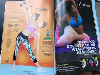
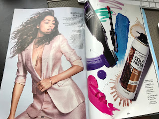
On another hand, I would like to address something of importance that has drawn my attention. As I was flipping through Cosmopolitan's March 2018 issue, that I bought at Publix, I have come to realize that 80% of the 180 pages in the magazine are ads. Ads on skin care products, makeup, face washes, shampoos... Therefore, although I would already have my four images to satisfy the minimum for this requirement, based on my sketches, I want my two page spread to reflect those in successful, well-established woman's magazines. I'm not sure of the format or articles I want to do yet, but here are some ideas:
 |
| I can put a workout plan on one page and then do an advertisement for a legging brand on the left. |
I know this is a lot, but hopefully I made it easy to follow, and you like where this is going😁😁😓
Enjoy the rest of your weekend!
Best Regards,
Sof
Canva. (n.d.). Retrieved March 11, 2018, from https://www.canva.com/
PROMAULAYKO, M., & LAGANI, D.K. (Eds.). (2018, March). COSMOPOLITAN. COSMOPOLITAN, 1-180
(n.d.). Retrieved March 11, 2018, from: http://images.google.com/


No comments:
Post a Comment